


Introducing the Qatar Cars Dataset
A modern toy dataset for a global classroom

Today’s post will be a little different than you may be used to, although longtime readers will see that it brings together data, Qatar, and higher education—three major themes of this newsletter. New Y Combinator readers may find this more or less interesting …
This is a story about how I came to create a dataset of car prices in Qatar, and why it matters. (For readers just looking for the GitHub link, the dataset is here; for R users, see
‘s R version.)Many statistical instructors, students, and analysts are familiar with the auto dataset (the one you call in Stata with - sysuse auto - ). Back in 1979, Consumer Reports, an American product-review magazine, compiled data about automobiles available in the United States. A few years later, a graphics textbook used the dataset to generate different examples of statistical graphs.1 I say “used” even though, back in 1983, anyone who wanted to use that dataset would have first have had to manually enter the data into their program so they could make this

into charts that looked like this:

The authors recognized that the dataset had ample pedagogical value. It combined a mix of continuous variables, like price and fuel efficiency, with categorical variables, like whether a given automobile was made in the United States or abroad. It thus allowed them to craft realistic and relevant examples for their audience.
The dataset was perfectly timed to be included with a then-new suite of statistical analysis software: Stata. As a result, introductory stats classes and advanced tutorials alike are full of references to the dataset. Want to explain how to graph a scatterplot and a linear regression line? Dead simple:
twoway (lfitci mpg weight ) (scatter mpg weight ) 
As you might have guessed, the heavier a car, the lower its fuel efficiency! (Really low—this was the 1970s after all.) Want to show that fuel efficiencies differed between U.S. and non-U.S. cars? Simple(ish)!
twoway (lfitci mpg weight if foreign == 0, color(gold) fcolor(gold%20)) ///
       (lfitci mpg weight if foreign == 1, color(purple) fcolor(purple%20)) ///
       (scatter mpg weight if foreign == 1, mcolor(purple)) ///
       (scatter mpg weight if foreign == 0, mcolor(gold))	///	   , legend(order(1 "Not Foreign" 3 "Foreign"))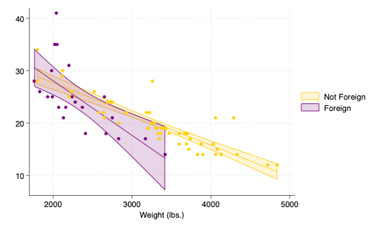
You get the idea—it’s a workhorse dataset. that can show basic relationships and provide useful examples readily.
Now, if you’re an American, you probably haven’t noticed anything weird about this. If you’re not American, and especially not Canadian or British, you’ve probably nodded along politely and gotten the gist of what I’ve said, but you’re also rolling your eyes.
Why? Because this dataset isn’t just old—it’s so America-centric that it’s basically as if Ron Swanson had gotten a job teaching data science:

Where do we begin?
Price is expressed in U.S. dollars (1978 dollars, at that)
Fuel efficiency is measured in miles per gallon
Headroom and length are given in inches
Trunk space is given in cubic feet
Weight is given in pounds (abbreviated as lbs.)
Turning circle is given in feet
Displacement is given in cubic inches
The world is described as foreign or not-foreign
When I taught stats in the United States, I didn’t notice any of that. However, now that I live in what the auto dataset would describe as “foreign”, I’ve come to grips with the fact that other countries—aside from Liberia and…Myanmar?—have yet to adopt Freedom units:

Teaching stats to undergrads is tough. It involves conveying content knowledge (how do we analyze data?) as well as procedural knowledge (how do we use these tools to analyze data?). Inevitably, it involves conveying substantive knowledge —even a simple chart like this one:
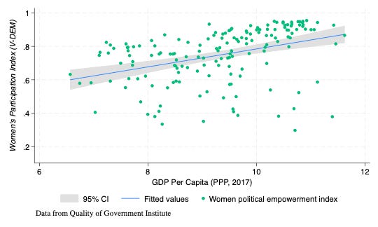
involves explaining a) the construction of the V-Dem women’s empowerment index, b) the measurement of GDP, c) the construction of purchasing power parity indices, and of course d) what the linear relationship is.
When I’m teaching political science students about politics, of course, I can justify spending the time on explaining those constructs. What I can’t really justify is spending the same amount of time teaching what an inch is or what miles per gallon is—because that’s just getting in the way of my job. And, no, basically none of my students knew any of these relationships in their gut—which is a problem when you’re trying to use a dataset to motivate interpretation of relationships!
That is: the same qualities that made the 1978 auto dataset attractive to American statisticians in 1983 made it really unfriendly to students outside of the United States in 2025.
So one of the first things I did this past spring term, when I was teaching stats in Qatar for the first time, is create the Qatar Cars dataset. (Okay, technically I had the students create part of it for an in-class assignment, but I edited it and finished it.)
The Qatar Cars dataset is a listing of prices and other specifications taken from YallaMotors Qatar , mostly in January 2025. It includes almost exactly the same variables as the auto dataset:
origin (the country associated with the car brand)
make (the brand of the car, such as Toyota or Land Rover)
model (the specific type of car, such as Land Cruiser or Defender)
length, width, and height (all in meters)
trunk capacity (measured in liters)
fuel economy (measured in liters per 100 km)
performance (time in seconds to accelerate from 0 to 100km/h)
mass in kilograms
price in Qatari riyals
and engine type (electric, hybrid, or petrol)
Most of the relationships are similar, as you might expect: fuel efficiency gets worse as cars get heavier:
twoway (lfitci economy mass ) (scatter economy mass ) 
but because of the units involved, the slope is reversed. And it has advantages, too. This being Qatar, the most expensive cars in the dataset are real head-turners: the Bugatti Chiron and Bugatti Centodieci, comfortably in the eight-digit riyal range. Want to teach people about logs?
twoway (qfitci log_price performance) (scatter log_price performance) , ytitle("Log Price (QAR)")
(And, yes, the relationship is more nicely linear if you restrict the price range under about 500,000 riyals.)
And if you teach in an international classroom, like I do, you’ll appreciate that the foreign/non-foreign binary has been replaced by a simple list of cars’ origins: Germany, Italy, Japan, PR China, South Korea, Sweden, UK, and USA.
As a further advantage, the cars in this dataset are actually under production. No more “AMC Pacer”, “Dodge St. Regis”, or Datsun anything—we’ve got MGs, Porsches, Cherys, Kias, Teslas, and Volkswagens. You know: cars students might actually see outside of a museum. And the prices are in line with current global car prices—no more cars costing $5,000. (1 USD = 3.64 QAR; 1 EUR ≈ 4.15 QAR.)
I am not always a fan of the term “global majority”, but when it comes to the use of the metric system it’s simply descriptively accurate. Datasets meant to help teach should actually help teach—not require an exercise in translation.
The Qatar Cars dataset is available under an open license at GitHub — no retyping required. Update 9 July 2025:
has put together an R version!Chambers, J. M., W. S. Cleveland, B. Kleiner, and P. A. Tukey. 1983. Graphical Methods for Data Analysis. Belmont, CA: Wadsworth.
In its own way, part of the process of disengagement from the US, and the legacy of its former dominance. Was always inevitable, sooner or later, but must now accelerate greatly. Still, as this example illustrates, thousands of steps involved, some tiny and some huge.